Case Study: Namesake Coffee
Namesake Coffee –
Inspired by Nature
The Inspiration
Inspired by the desire to live intentionally, their background in horticulture and love of nature, founders Michael and Jessica Beans created Namesake Coffee to inspire others to slow down and enjoy life through the peace of intentionality crafting a delicious cup of coffee.
We worked with them to create their full brand ecosystem and identity – from the logo, monogram, and color palette to the many custom graphics and illustrations, packaging experience, brand collateral, photoshoot direction and their e-commerce website (website coming soon).
The Challenge
Our primary challenge was to create a unique visual identity with a strong presence that would stand out and be memorable in a competitive market.
Our second challenge was to ensure a smooth and enjoyable experience for the customer from the digital store and online membership, to holding the product in-hand.

The Brand
The joy of slow mornings and slow brews, of dreaming big, living intentionally, and enjoying life is present within the brand’s overall aesthetic, thoughtful messaging and laid back, optimistic tone of voice.
The visual identity is inspired by the founder’s passion for nature – their knowledge of horticulture and farming practices, and the natural flavors found in their roasts. Designed to reflect the brand’s primary value, growth, we combined a palette that evokes feels of growth and new possibilities with custom illustrations, natural textures and compostable packaging materials, bringing the brand to life.

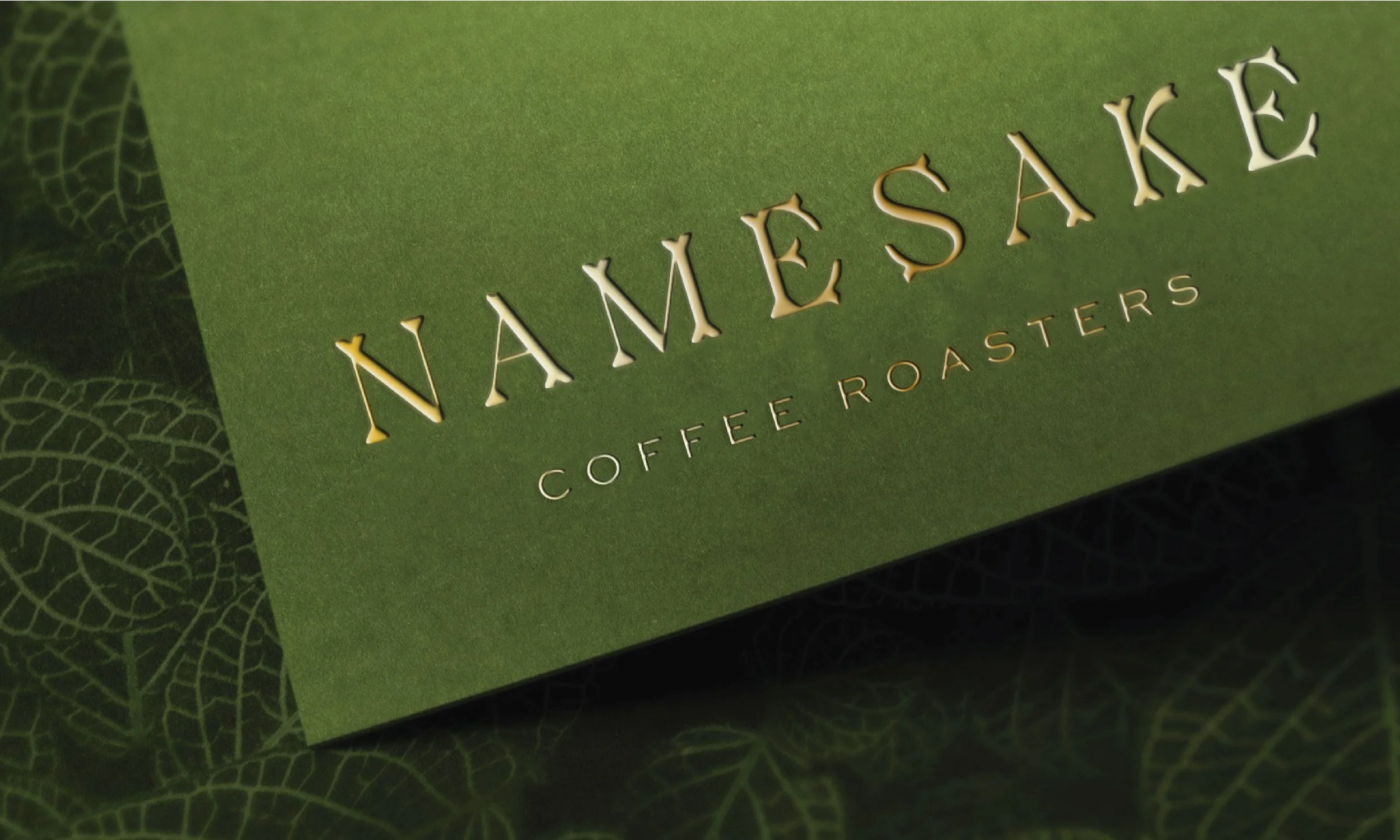
Keeping to this visual theme, the primary logo emulates a natural theme through letterforms that appear to be branches growing in all directions. Through the use of uppercase typography and a detailed approach to the artwork, the logotype appeals to both the brand’s quirky and casual side and the quality of their product, giving it an overall elevated appearance.
The monogram creates a memorable secondary logo that uses rounded serifs to mimic growth in a more subtle and minimal way. Combined with the unique clover background shape, the monogram introduces a unique design element that can be used in place of more traditional shapes like circles or squares, continually reinforcing brand recognition and memorability.

The Packaging
Keeping the brand values in mind, as well as serving to further differentiate the brand in a crowded market, we designed the packaging with sustainability in mind. When sourcing the packaging, we decided to use a compostable material for the bag combined with seed paper for the labels, to considering the full life cycle of not only the product, but the packaging as well.
With stories of each farmer and daily prompts for intentional living included on each label, tucked into the custom pocket on the back of the bag, and the design using a combination of natural elements and colors, everything comes together to create an intentional and inspiring coffee product unique to the industry.

Want to see more images from this project? Check it out in our portfolio.
Are you ready to level-up your branding?
Check out our services to see how we can work together, and let’s have a chat to evaluate the problems you’re currently facing in business and how your branding might be falling short, so we can create a plan for your business and brand moving forward. Our goal is to create a beautiful brand that solves your problems and serves your business better.
Interested in working together on your brand? Reach out via our Client Application form below. :)