Industry
CONSUMER BRANDS
Specialty Coffee
year: 2023, 2026
Scope
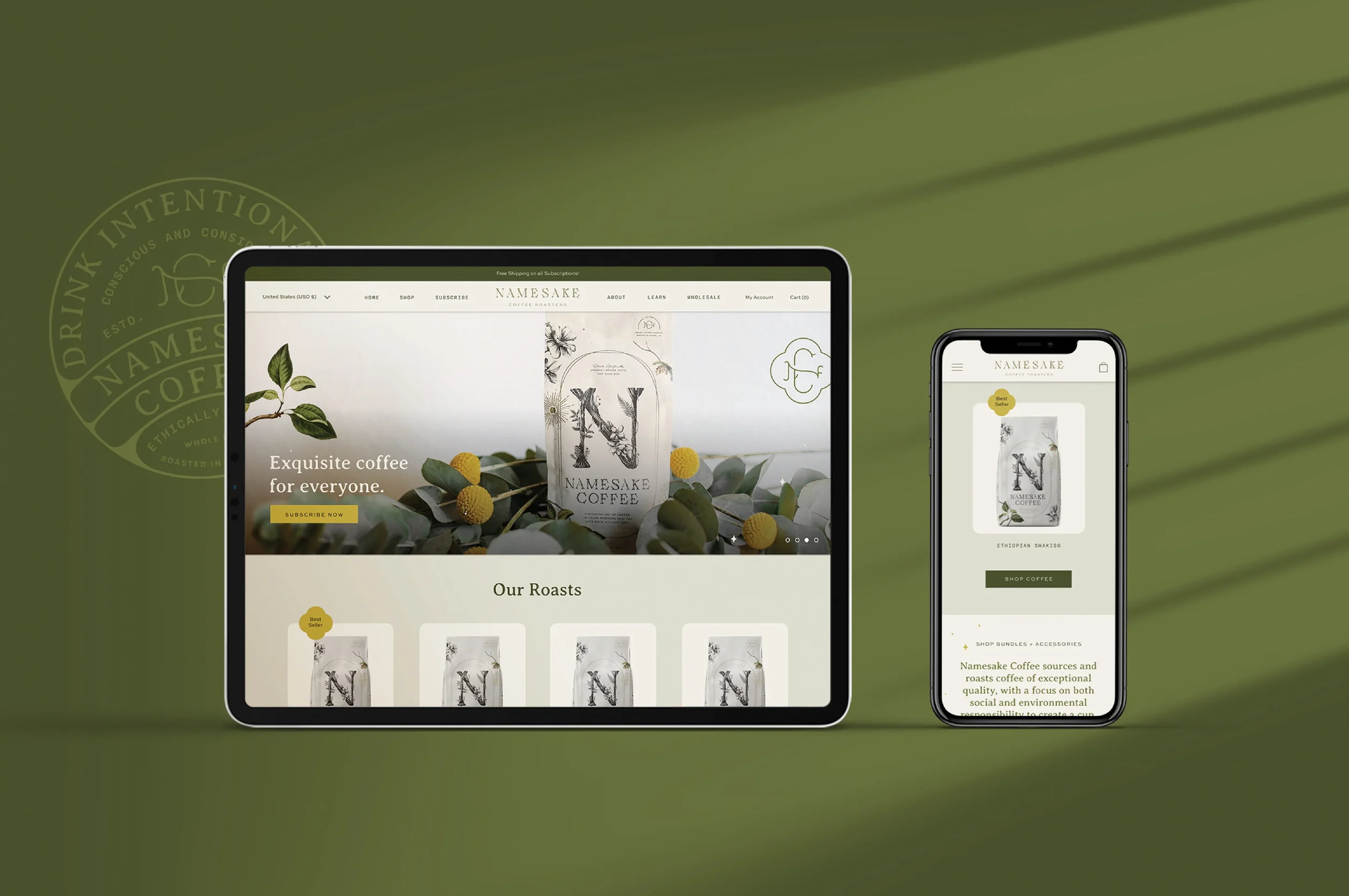
Brand Strategy, Visual Identity, Packaging, Art Direction, website + development
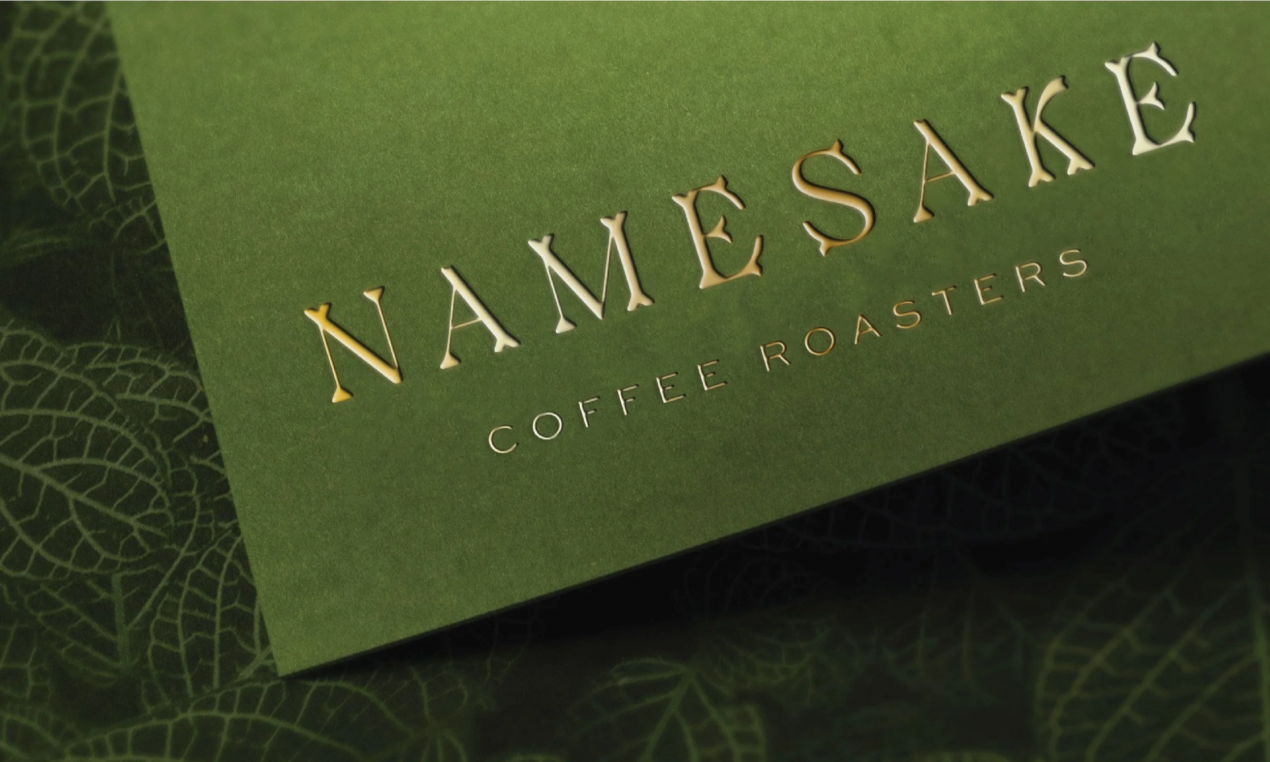
client: namesake coffee
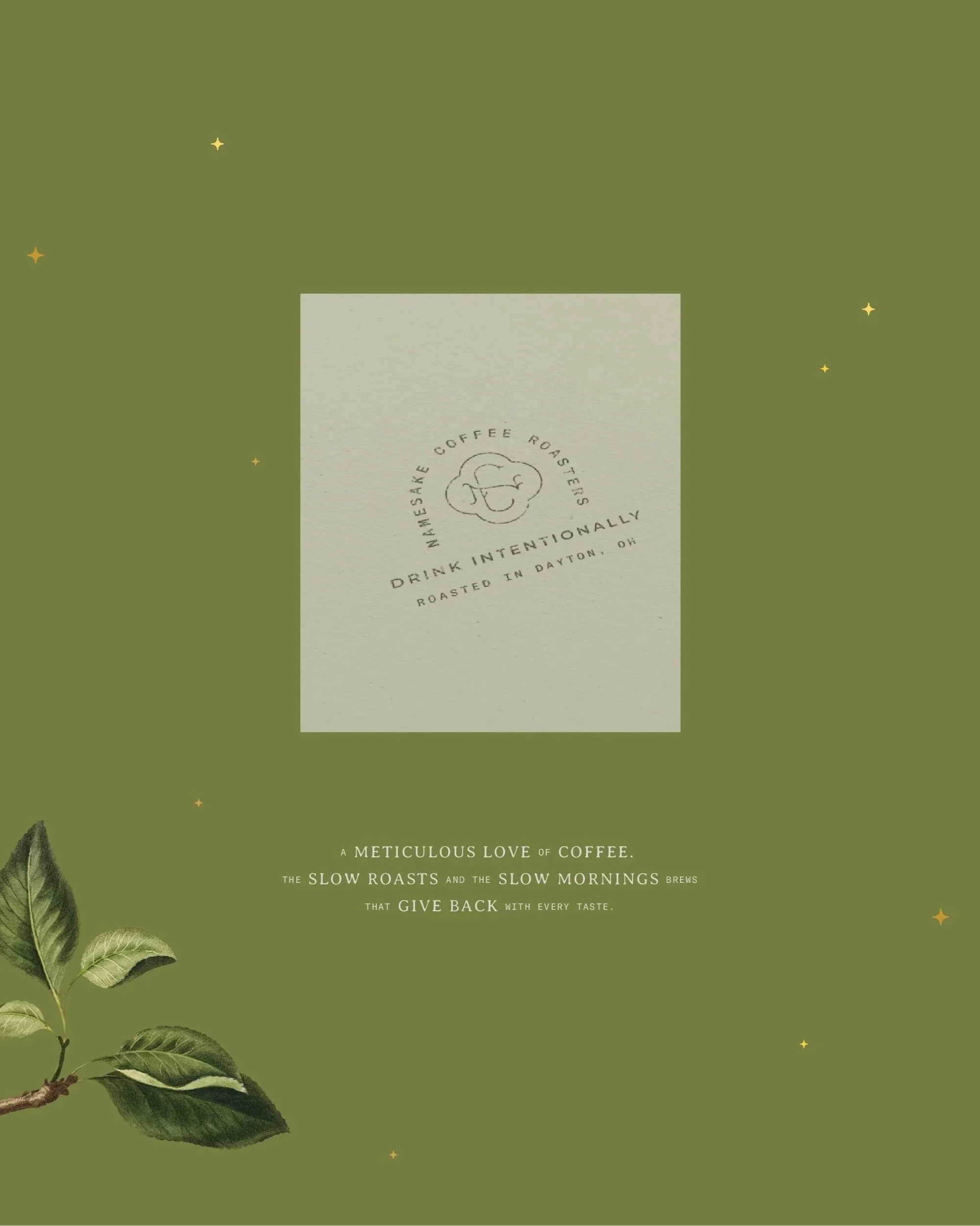
From commodity product to morning ritual. We built Namesake Coffee's brand from the ground up with a botanical identity system, compostable packaging, and Shopify experience that turns conscious millennials into loyal subscribers and a small Ohio roastery into a subscription-ready brand people genuinely love.
I. Growth Barrier
Namesake Coffee Roasters came to Brittany with a business built on genuine depth: a founder with a horticulture degree, single-origin sourcing, fresh-roasted beans, and a growing subscription service. What they lacked was a brand that could hold all of that.
In a crowded specialty coffee market filled with minimalist trends and interchangeable café aesthetics, the disconnect between product quality and brand perception was limiting growth.
The brief was clear: reach conscious millennials who wanted great coffee at home but didn't yet know how to choose or brew it. Win their trust not through the aspirational vagueness of trendy coffee brands, but through genuine stories, real education, and a brand experience worthy of becoming part of someone’s daily ritual.
II. Brand Evolution
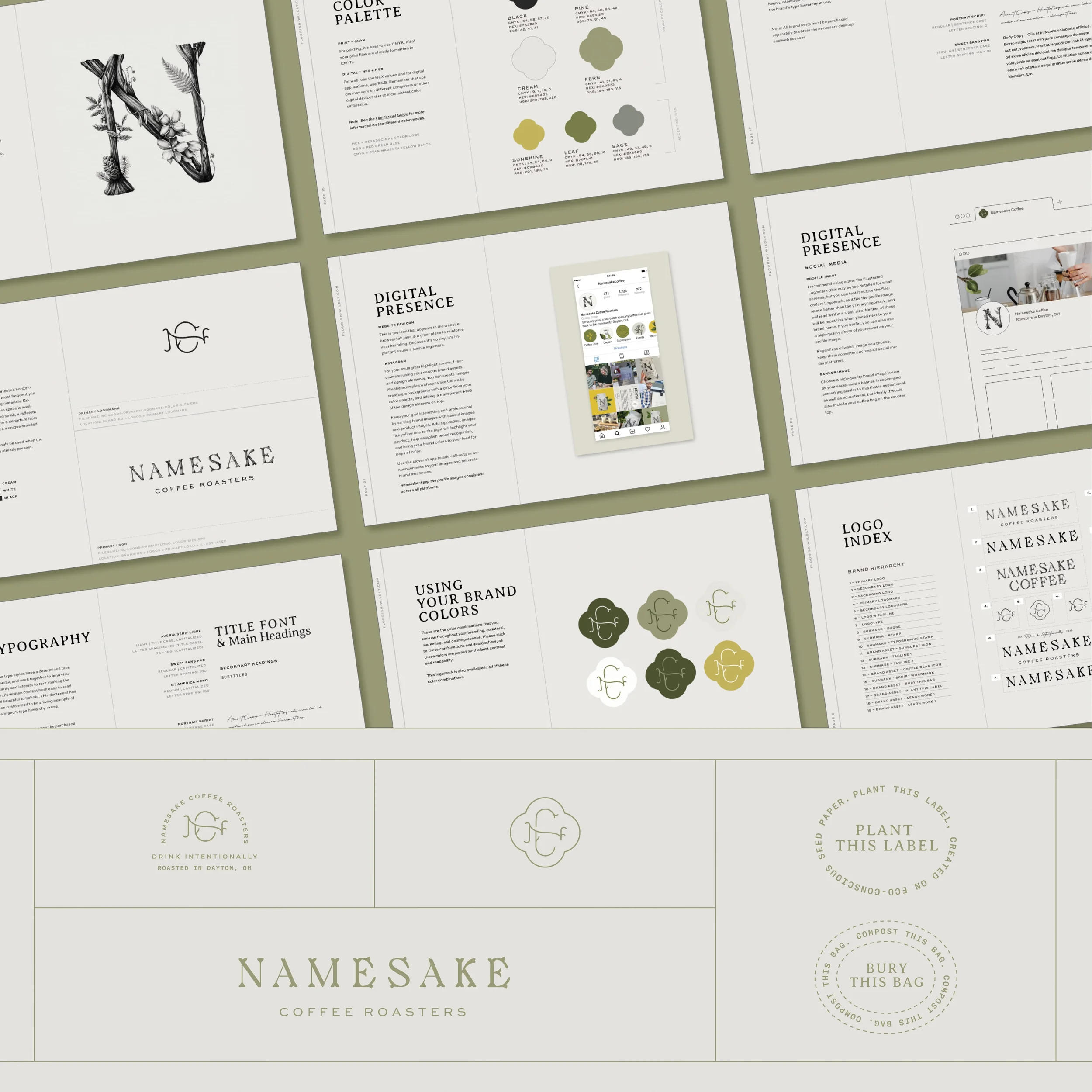
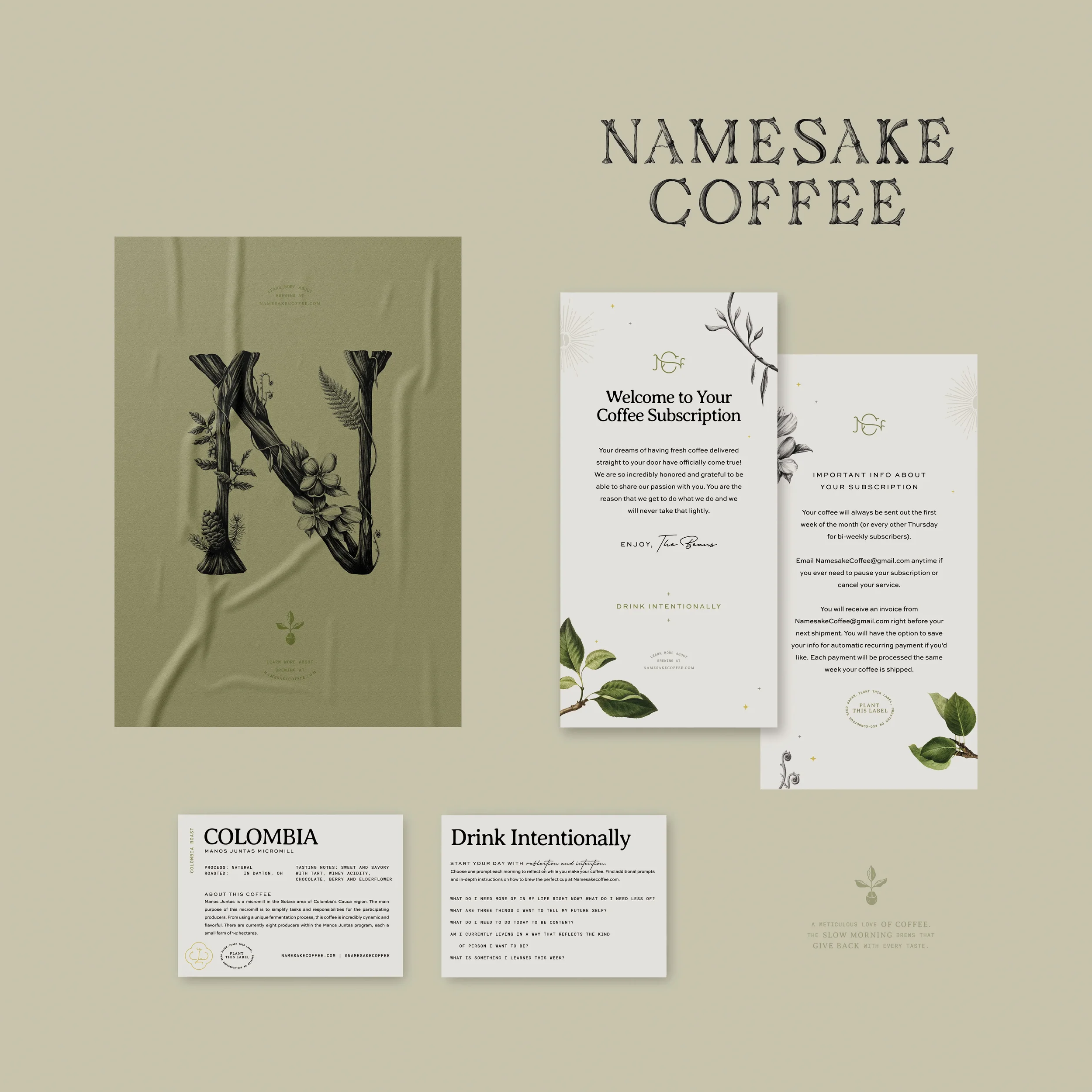
We evolved Namesake from a small craft coffee roaster into a ritual-driven subscription brand rooted in story, sustainability, and a deep love of nature. The brand transformed from a commodity coffee product into a meaningful daily ritual.
The result is a brand that resonates with plant-loving, conscious millennials while honoring the values, expertise, and craft that make Namesake distinct.
III. Results
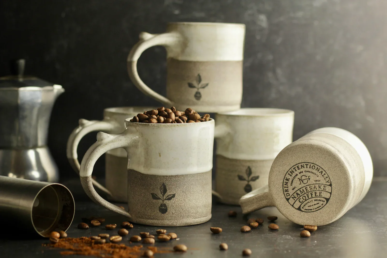
✦ Elevated Namesake from an in-house coffee roaster into a fully realized, subscription-ready brand experience
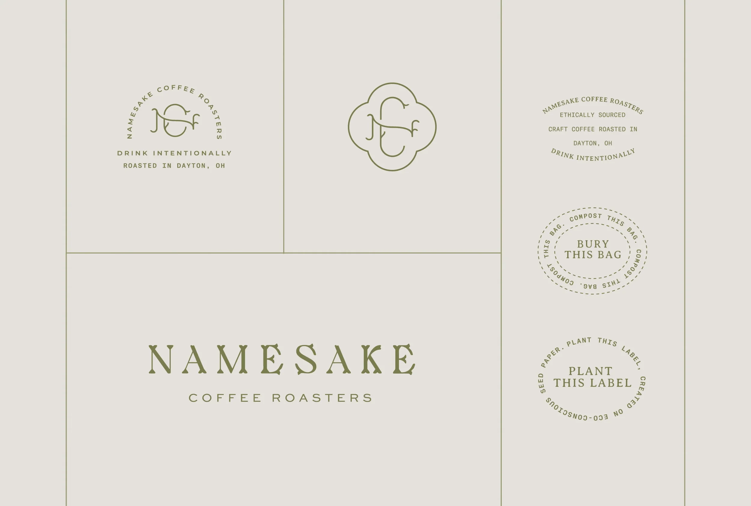
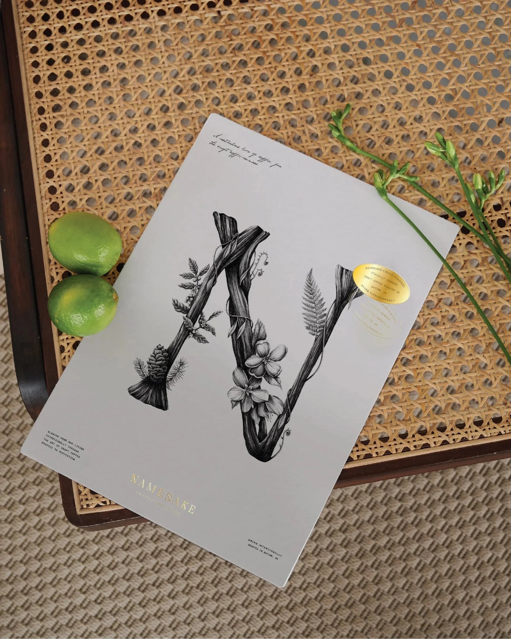
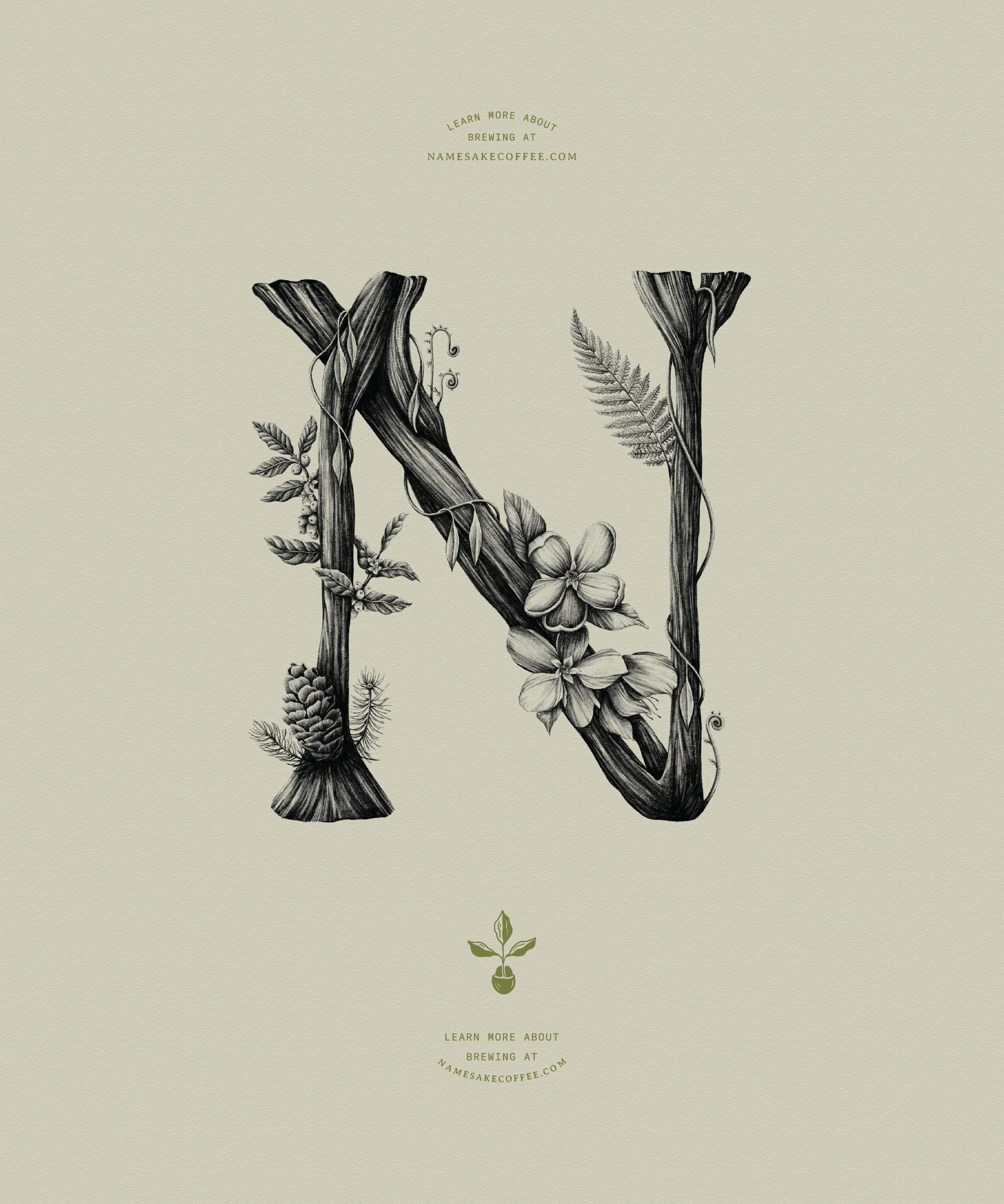
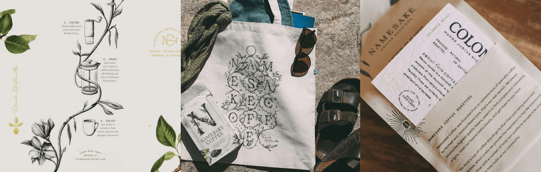
✦ Premium, collectible packaging rooted in sustainability, featuring compostable materials and plantable seed paper labels
✦ A timeless brand identity centered on sustainability, ritual, and emotional connection rather than trend-driven coffee culture
✦ A cohesive and flexible visual system across all brand touchpoints, designed to grow alongside future blends, products, and offerings
✦ Positioned Namesake as an experience-led coffee brand with a stronger sense of story, intention, and customer loyalty