Industry
Fine Art Jewelry
Luxury eCommerce
Deliverables
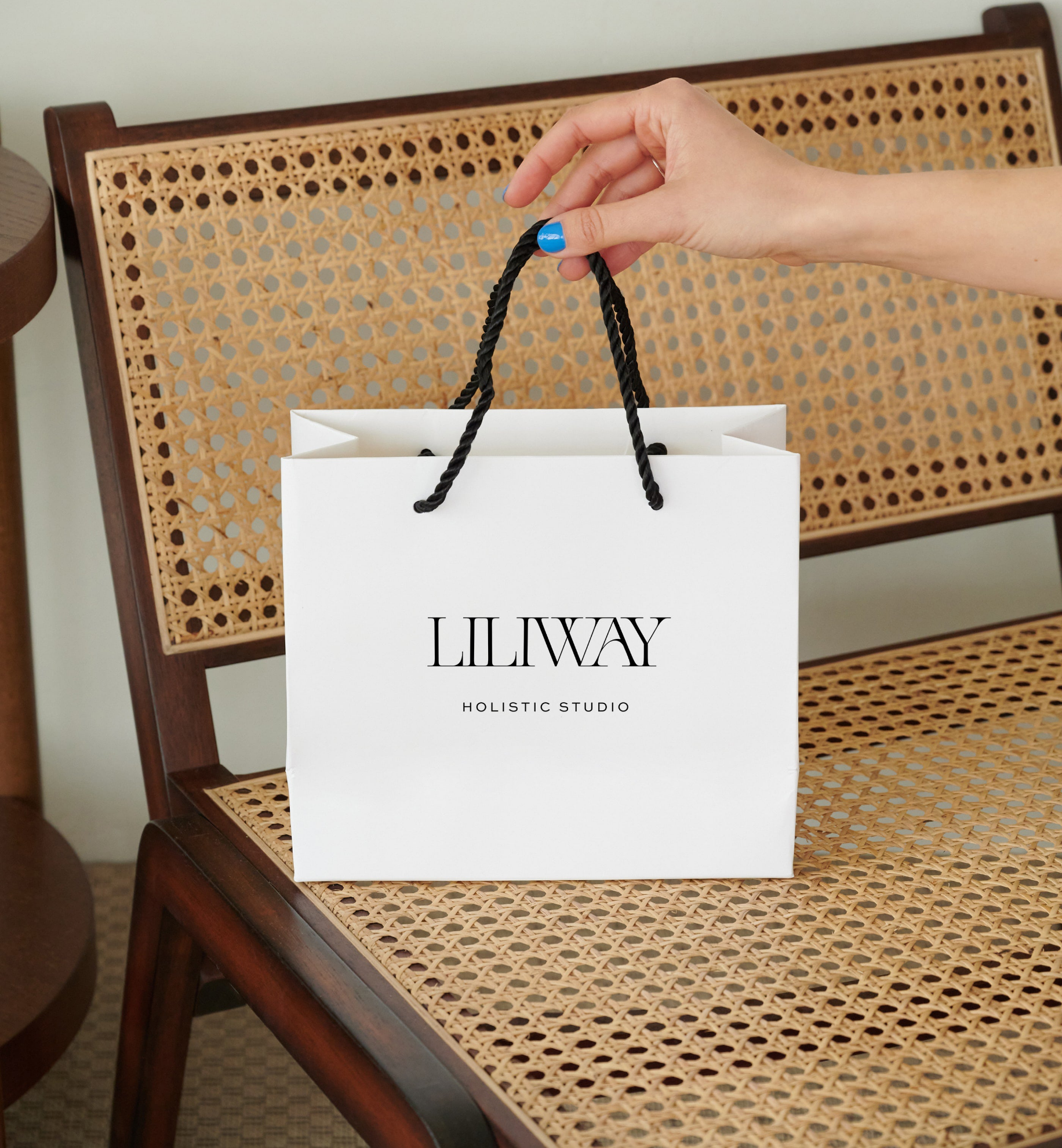
Visual identity system, logo suite, stationery, Website Design + DEVELOPMENT
year: 2024
client: BETH farber jewelry
Beth Farber has spent decades perfecting a singular art form. She hand-weaves gemstones and 22-karat gold beads using ancient techniques and bead weaving methods that trace back to Egypt, Greece, and Rome, into one-of-a-kind pieces whose fluidity suggests, as she puts it, the presence of inner grace.
Her jewelry has appeared on Fox TV's Gotham and in the Smithsonian Museum shows.
I. The Opportunity
Beth Farber creates handcrafted fine jewelry inspired by organic forms and natural textures. Through custom commissions, shows, and word of mouth, she had built a loyal following and a body of work that blurs the line between adornment and art.
Beth's pieces are meant to be seen in motion, worn against skin, and admired in the light. The tactile experience is the entire point. Translating that sensory reality into a screen required a different logic than most eCommerce thinking: less conversion architecture, more atmosphere.
Beth's jewelry carried the presence of a gallery piece, but her brand and digital presence didn't yet reflect that same level of luxury and refinement. Our goal was to create a brand identity and website that reflected the quality of the work itself and provided a cohesive experience for collectors, custom clients, and first-time buyers alike.
II. Brand Evolution
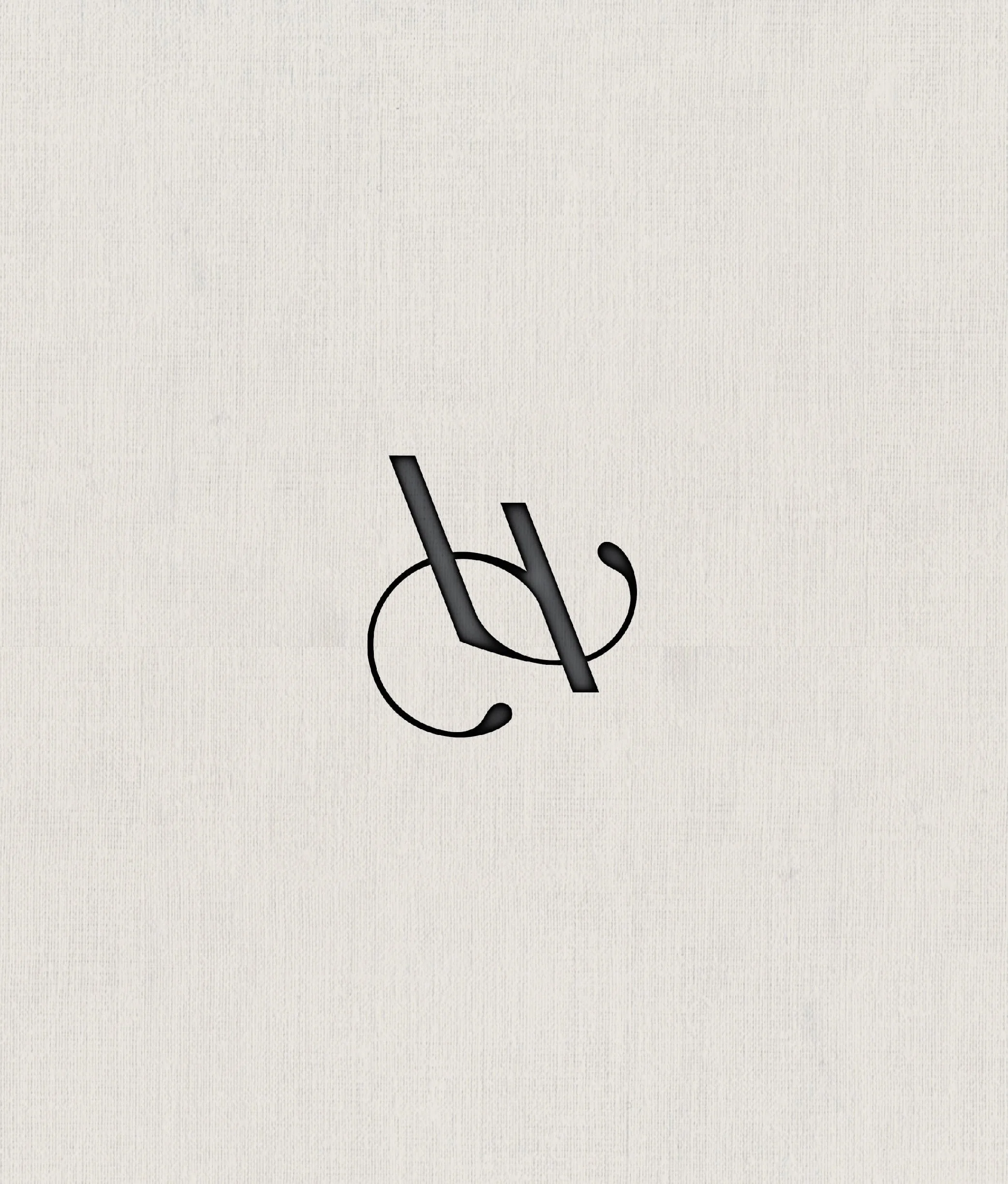
The logo had to be the first decision, and it had to be right. Beth's work is defined by depth, so a flat wordmark felt immediately wrong. Instead, we built a mark that catches light the way the jewelry does: a three-dimensional gold treatment with a sculptural presence, something that reads differently depending on the surface it's placed on.
The logomark — a refined BF monogram — was developed to work at intimate scale. On a hang tag, inside a box, pressed into stationery. It needed to feel handmade without being rough, classical without being stiff.
III. Results
✦ A jury of curators selected her work to exhibit at the Smithsonian Craft Show twice, one of the most prestigious craft exhibitions in the country, after launching the new brand and website. While Beth’s artistry created that recognition, the brand ensured the work was taken seriously the moment it was seen.
✦ Site architecture that supports both the collector experience and the custom client journey
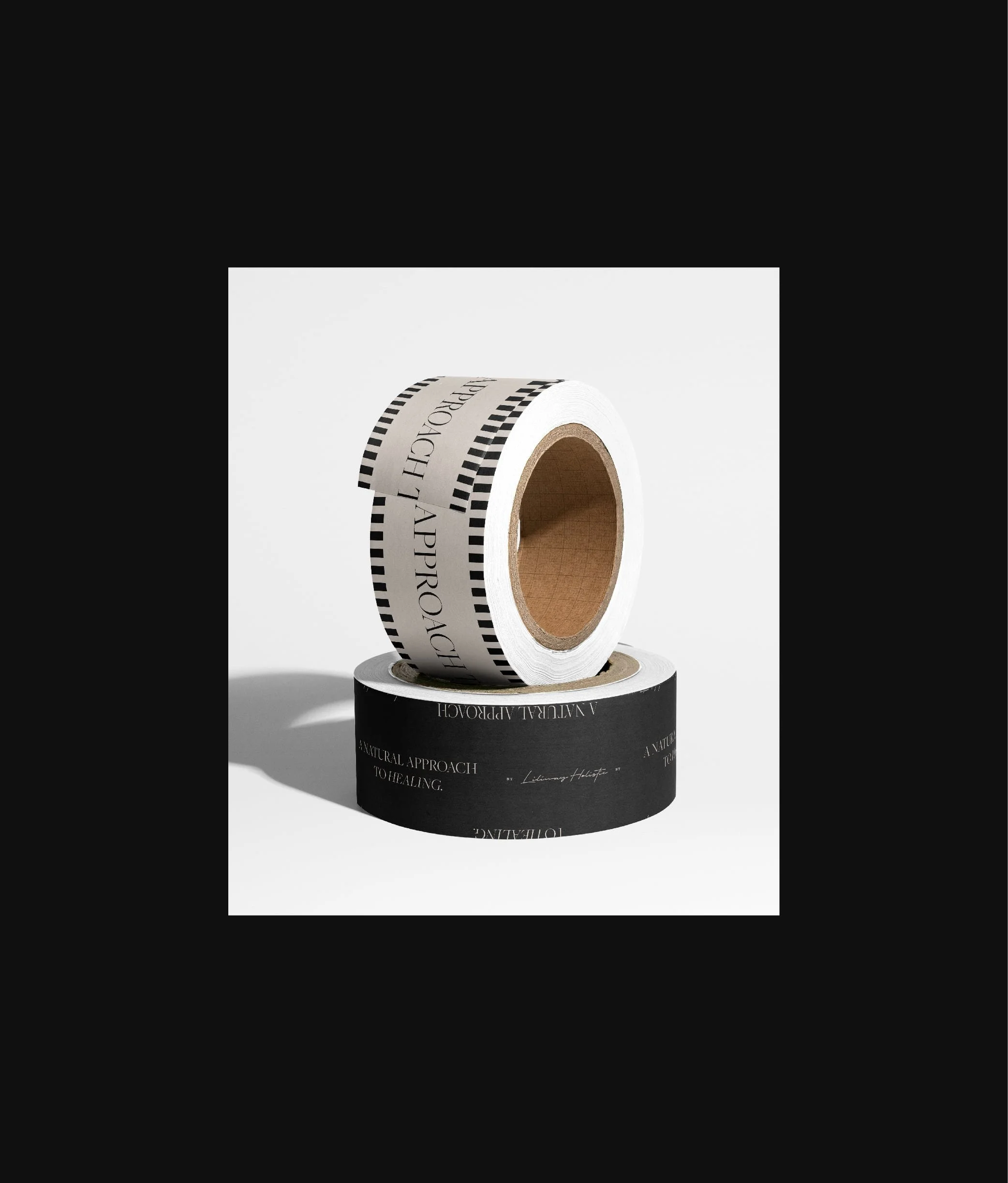
✦ A cohesive brand system that supports marketing, exhibitions, gallery applications, future growth, and work that has been seen on national television
✦ A visual signature for her brand with a 3D gold logo distinctive enough to read as a mark of authorship, and a brand presence Beth confidently shares with collectors, galleries, and prospective clients
✦ Increased inquiries for custom commission work
The Logo
The logo went through multiple versions before the 3D treatment. The decision to give it depth came directly from looking at how Beth's work catches light differently at every angle. Beth's previous mark didn't carry the weight of her work. It needed something that felt handcrafted; as precious and specific as the jewelry itself, without looking ornate or overwrought.